This will be a first. Charlie Athanas here. I design the posters for WildClaw's play productions. Normally, if I think there is enough interesting going on in the design process, I put that process up on our website after we have performed the run of the show (The Great God Pan poster and The Dreams in the Witch House poster).
For KILL ME we have decided to lay bare more of our process before you see the show, so possible SPOILERS ahead.
 For KILL ME, we have changed the poster design process by including more people in on the decision process. I typically work with just the director to get their vision of the production they are mounting. Sometimes, not even that, because some directors want nothing to do with the marketing of their show. In this instance I am working with the director (Jeff Christian), WildClaw's Artistic Director (Aly Renee Amidei), and the play's author (Scott T. Barsotti). As you will see later, this often leads to hilarious decision processes, but it also brings in a lot of collaborative viewpoints and some clarity on what it is we are trying to sell you.
THE TOP THREE IMAGES
When I first started looking at ideas, I was way off the mark. The idea I wanted to convey was a central character whose suicidal impulses were splattering over into the other character's lives. We also have three very attractive women in our leads (left to right: Casey Cunningham, Sasha Gioppo, and Michaela Petro) and it would be nice to have them on the poster. Plus, the play's title, KILL ME, is powerful in and of itself.
In the fourth image, I was looking to convey the duality of the lead character's dilemma in the script.
 But, after meeting with the Jeff, KILL ME's director, I realized I was missing a lot of the subtleties of the production Jeff was putting together. My favorite part of the process is sitting with the director to explore with them what they are trying to communicate with their version of the script. I think it is also helpful to the directors to have to actually verbalize to someone else the absolute essence of the message. It often raises questions that haven't been looked at before in the design and rehearsal process.
THE SKETCHES
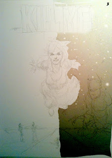
After my talk with Jeff, I went away and looked over the notes from our discussion and came away with three sketches to present to Jeff, Aly, and Scott. Here is where we come to the part of the collaborative process that you can either laugh or cry about. They liked all the sketches.
Aly liked #1 the best.
Scott liked #2 the best.
 Jeff liked #3 the best.
My preference was #4.
Ah ...
So, now I am at the process of taking in their feedback to produce the final image. It will incorporate something from all of the sketches I suspect and then will be simplified to create a strong. powerful image that can be read from across the street. That's the goal any way.
More to come this week.
 P.S. I always find it amusing to here from theatre companies that tell me they are surprised that WildClaw and the director have any input on the poster image. Typically, they get an artist and take whatever they get back and hope it's the right image for their play.


2 comments:
these are all fantastic!
i'm into poster #4 myself.
You are a wise person with wonderful taste. Thank you. - Charlie
Post a Comment